ETHEREAL NEXUS
Dev Tools · Product designMaking component management clearer.
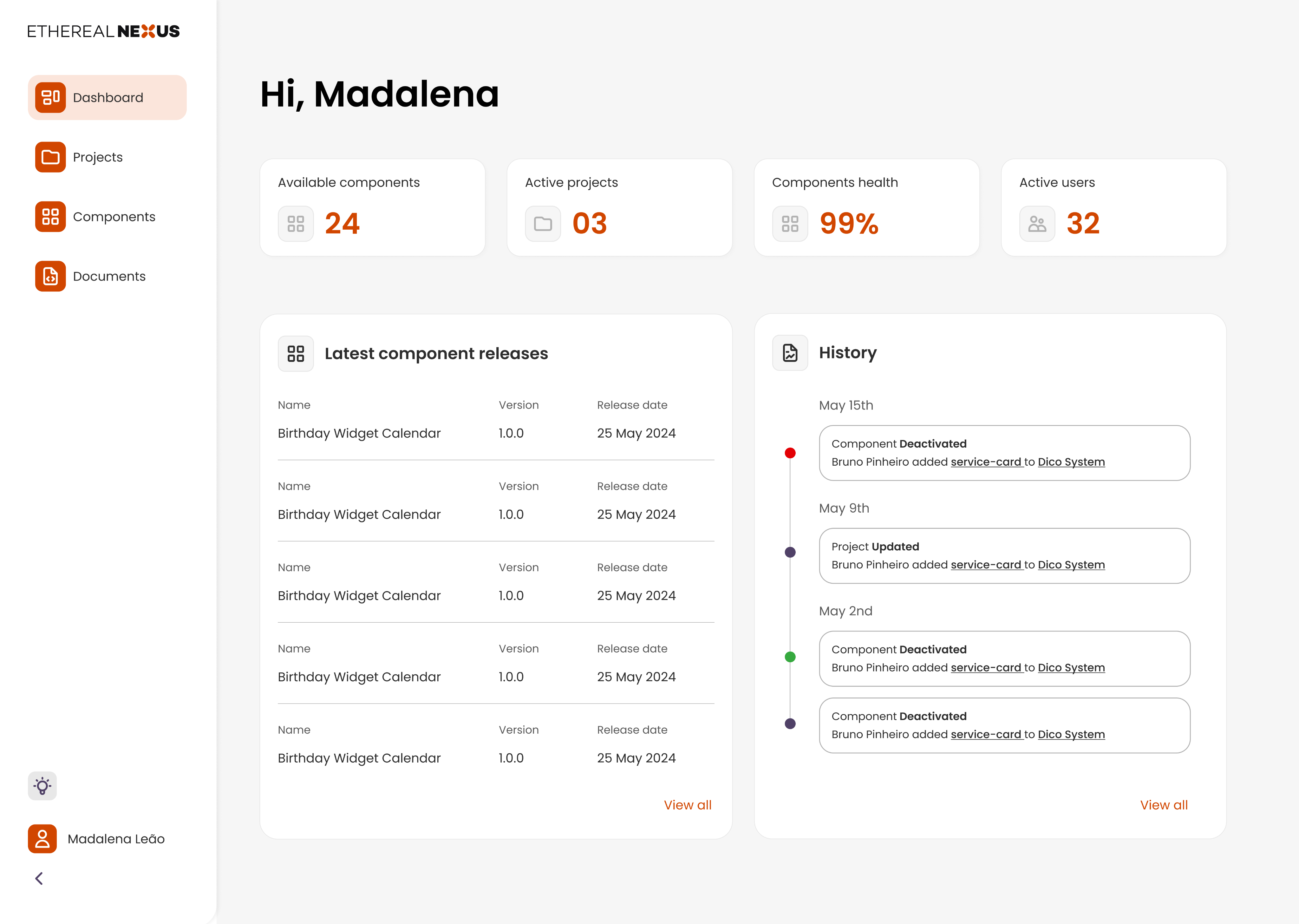
I redesigned a developer dashboard to help people find components, understand their status and manage updates with greater clarity.
Product Designer
6 months
Figma
Devs
1 PD · 1 FE · 1 BE · 1 PM
01 · CONTEXT + PROBLEM
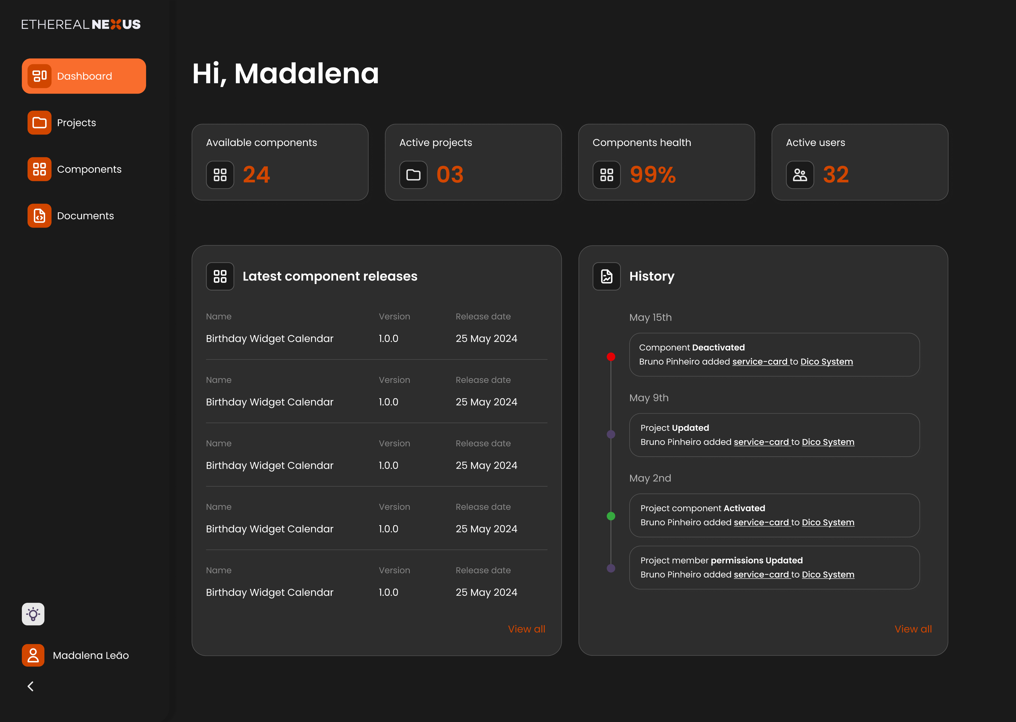
Ethereal Nexus is an open-source tool that connects independently developed frontend components with Content Management Systems. Its dashboard supports the work of developers creating and maintaining those components.
The existing experience made everyday tasks harder to navigate. Components were difficult to find, status labels were unclear, and editing and saving offered limited feedback.
The challenge was to make component management easier to understand, from finding an item to knowing whether an update had been applied.
02 · research + strategic reframe
Research revealed friction in everyday workflows.
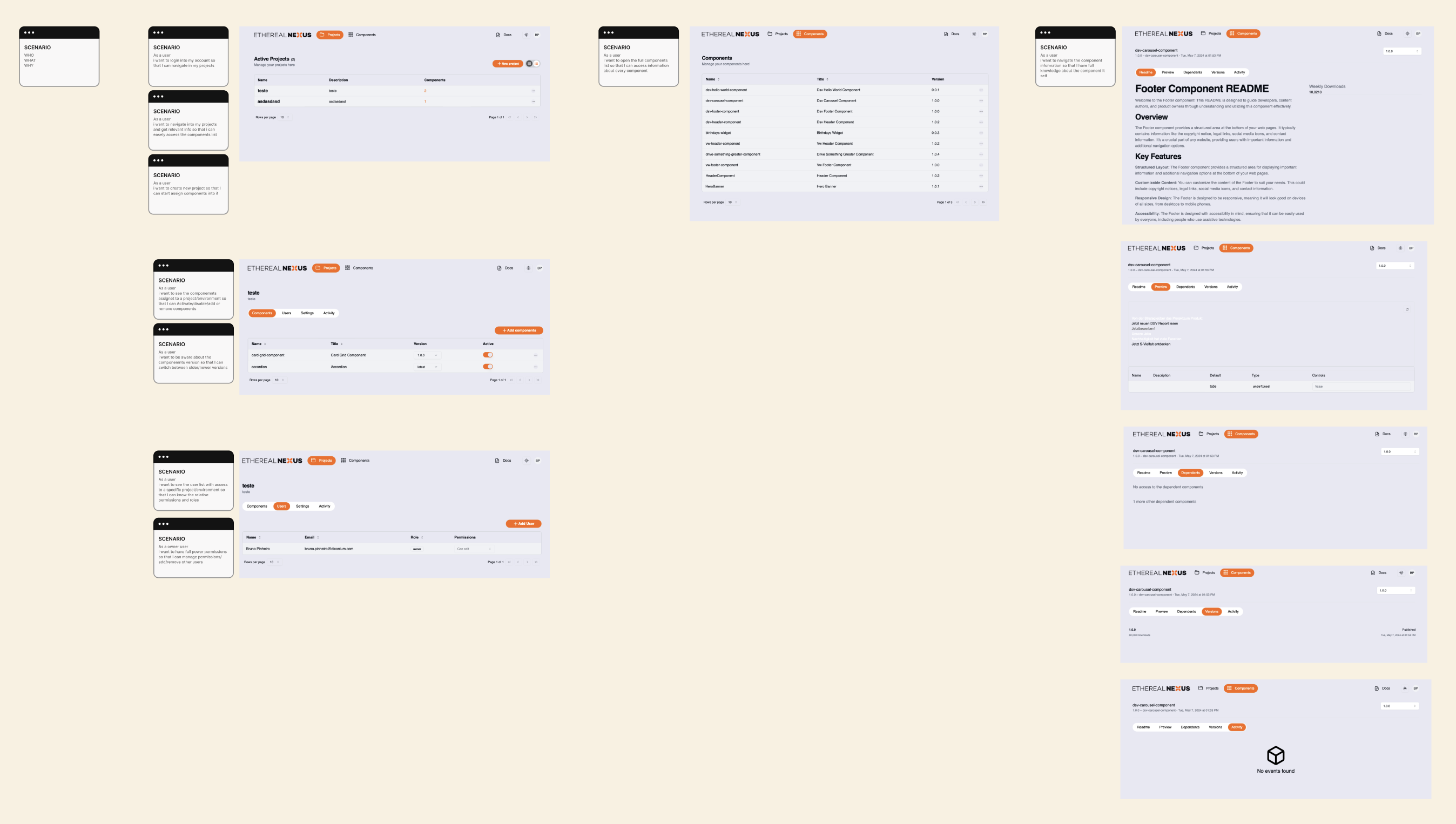
I interviewed frontend developers and used realistic task scenarios to examine how they found, edited and managed components. The findings highlighted recurring issues around navigation, status clarity and feedback.
FINDABILITY
Locate components without
scanning long lists.
STATUS CLARITY
Understand which components are
live or staged.
EDITING
Reduce friction in everyday updates.
FEEDBACK
Know when changes have been
applied.
Turning insights into a design direction
I translated interview findings into How Might We questions and explored solutions with the developers and product manager. A persona and journey map kept the discussions grounded in developer workflows, while value-versus-effort prioritisation helped balance user benefit with implementation effort.
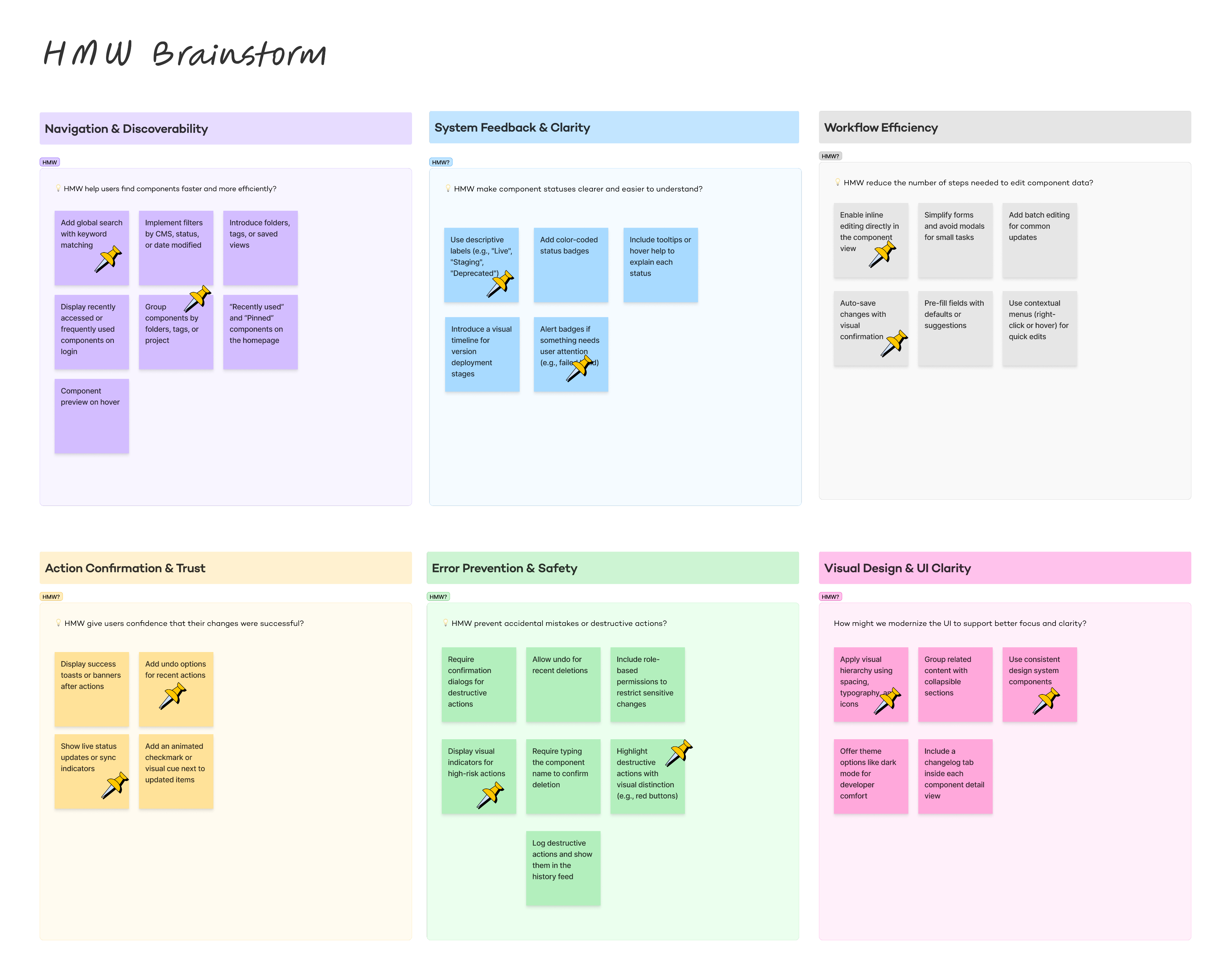
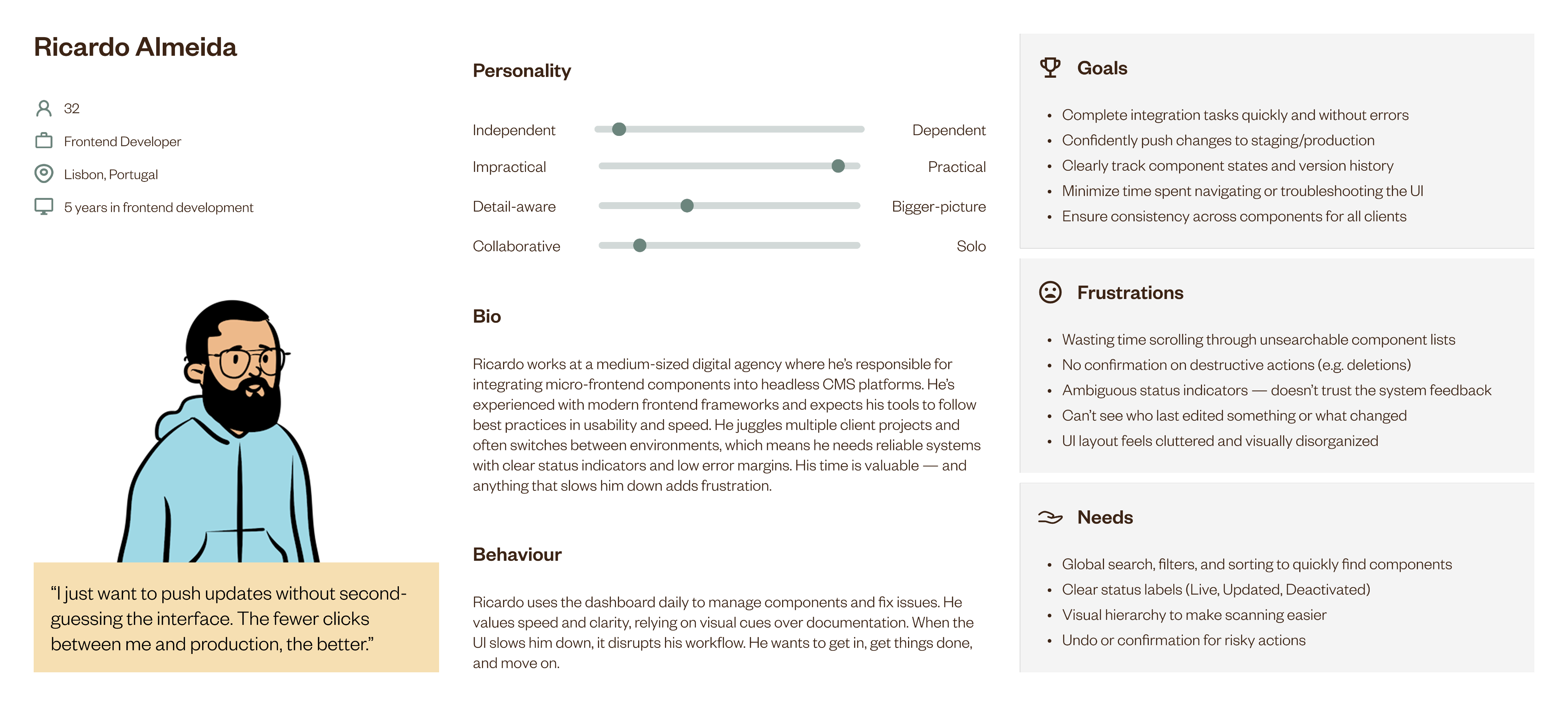
Design direction: make components easier to find, their state clearer and updates easier to manage.
03 · Prioritising
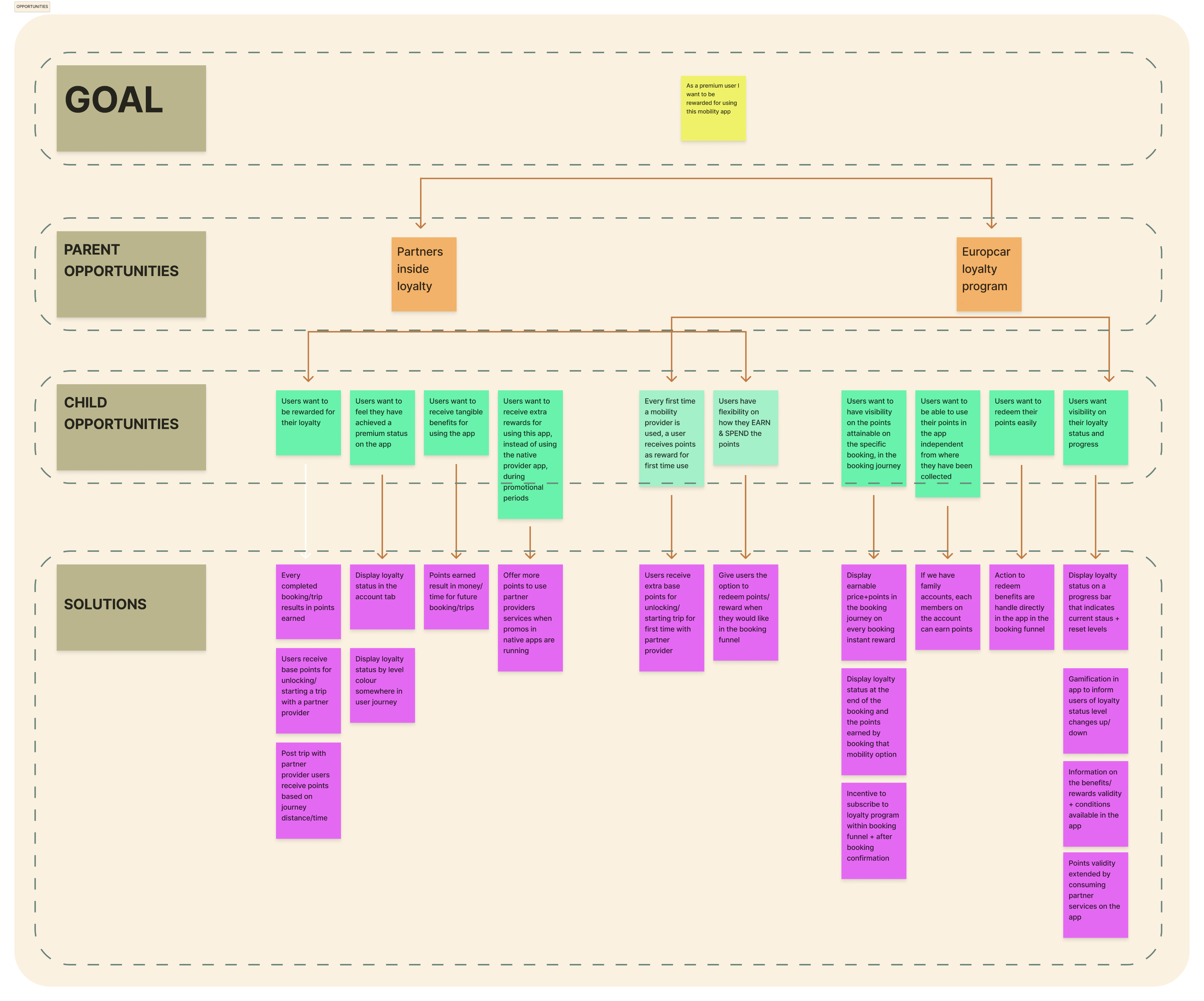
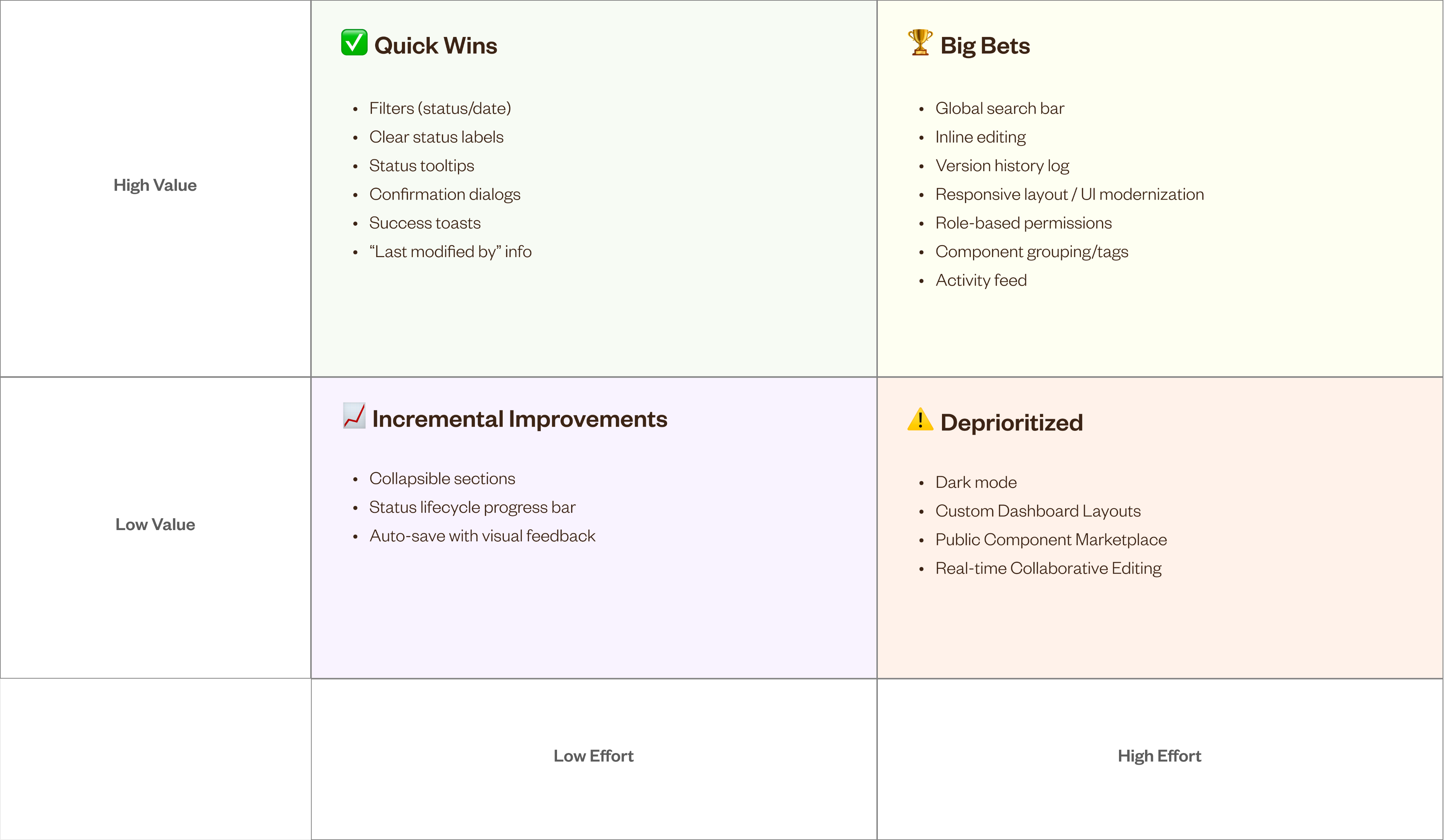
Feature prioritisation
Using a value-versus-effort framework, I worked with the team to prioritize features that balanced maximum user benefit with feasible implementation. This ensured the roadmap focused on delivering high-impact improvements quickly.
Wireframes
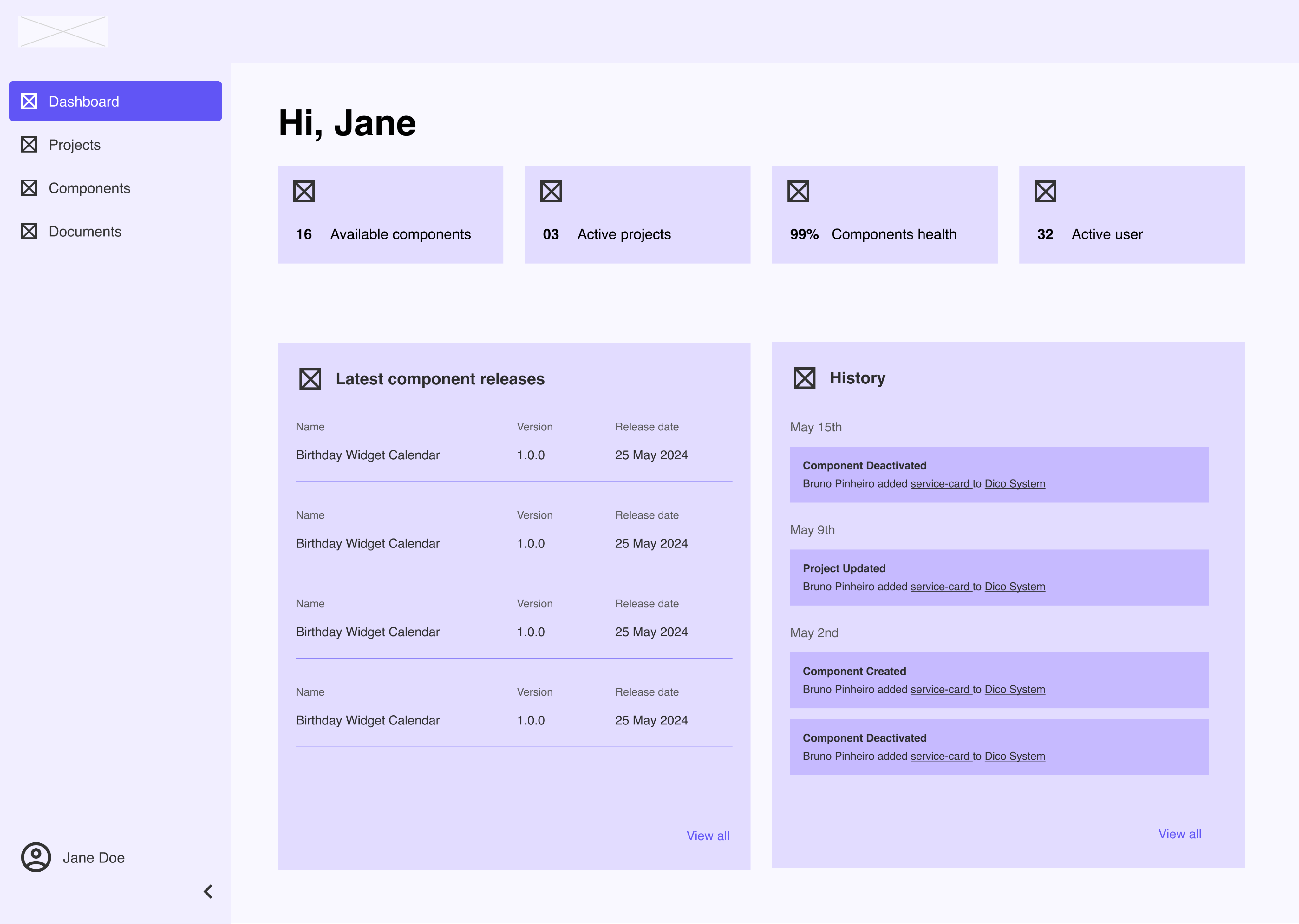
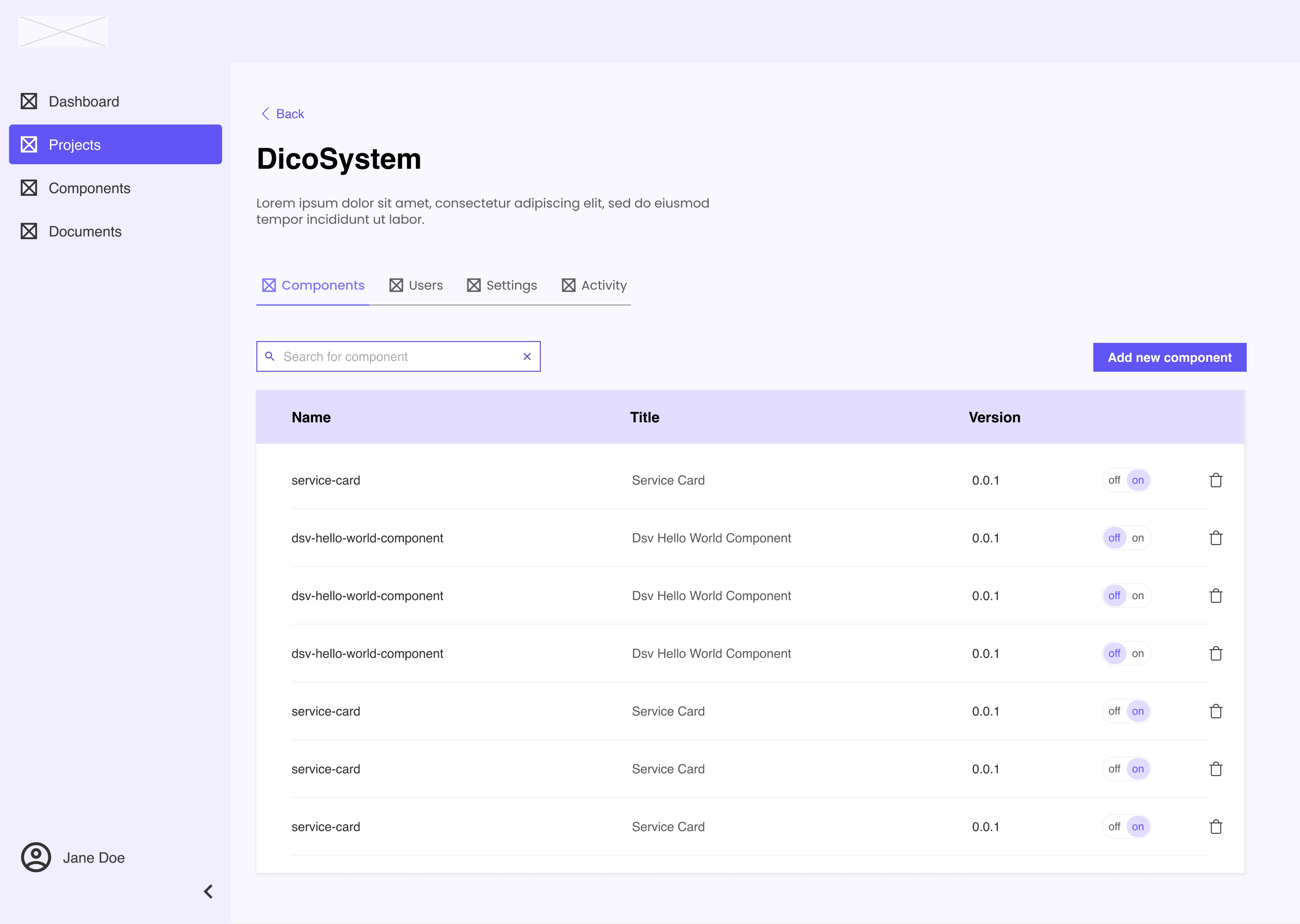
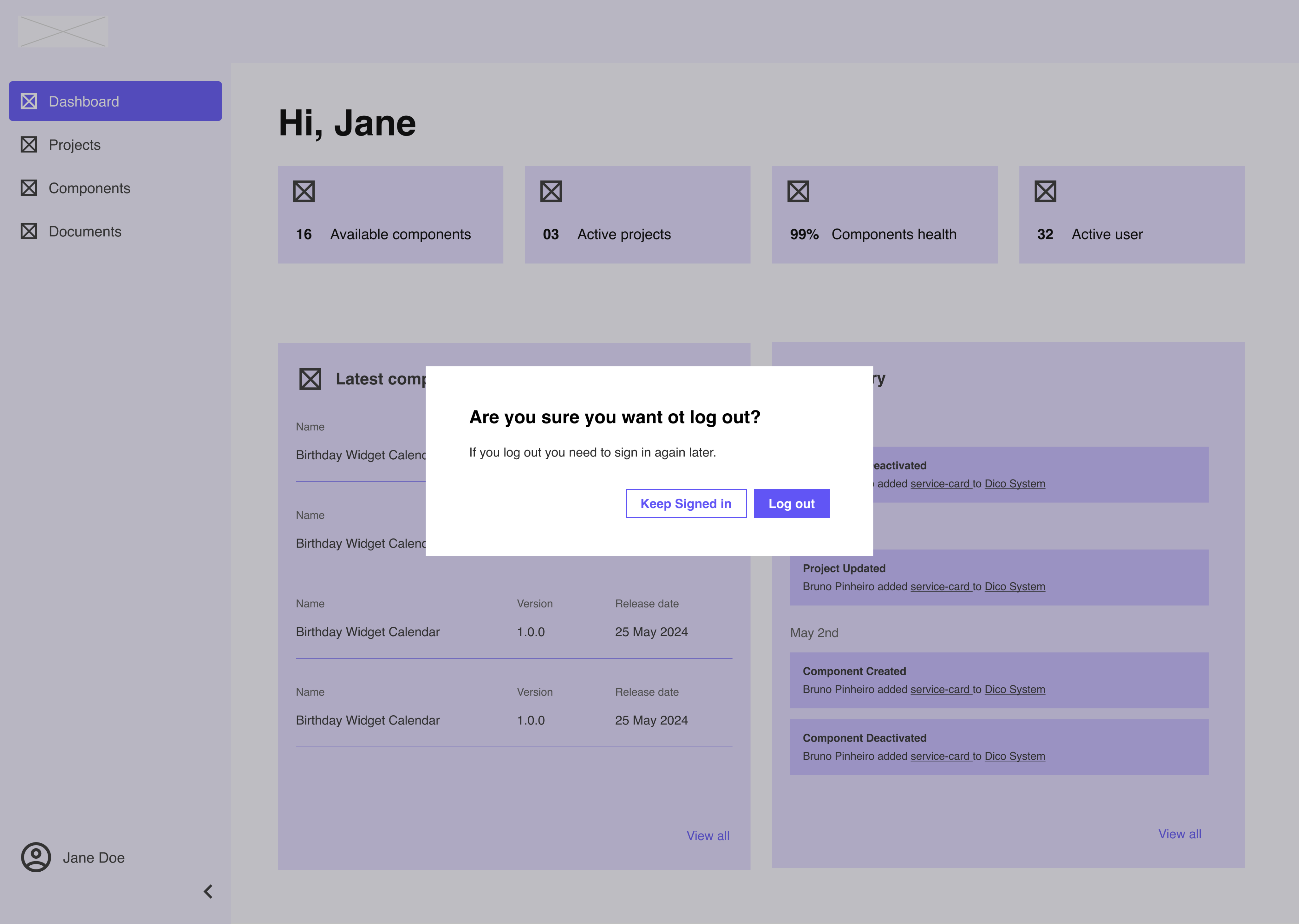
With a clear understanding of user pain points, priorities, and feature opportunities, the next step was to begin exploring the structure and layout of the redesigned dashboard. Wireframes were created to visualise potential solutions and ensure that the core workflows were intuitive, efficient, and aligned with real user needs.
04 · Outcome
A clearer foundation for developer workflows
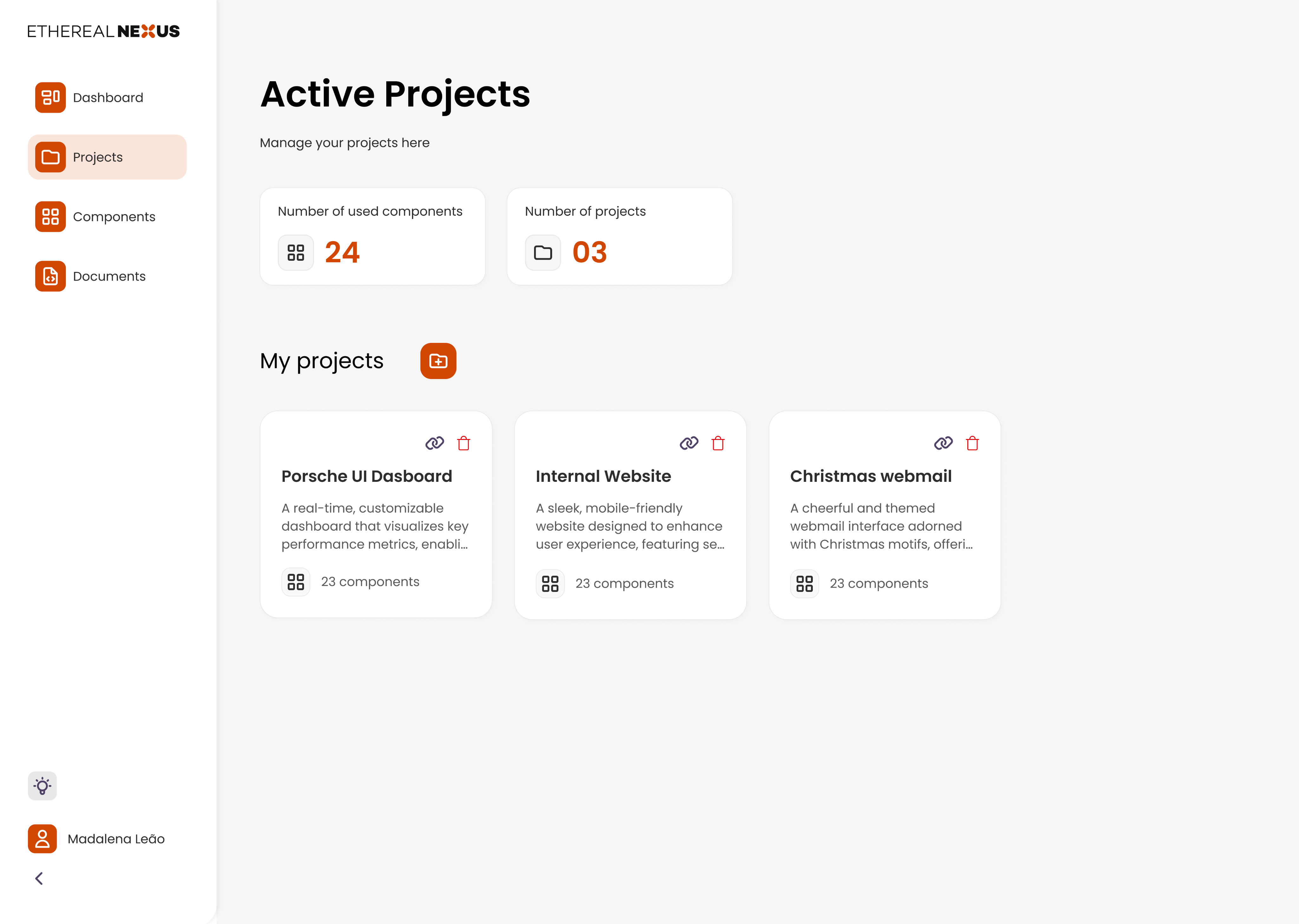
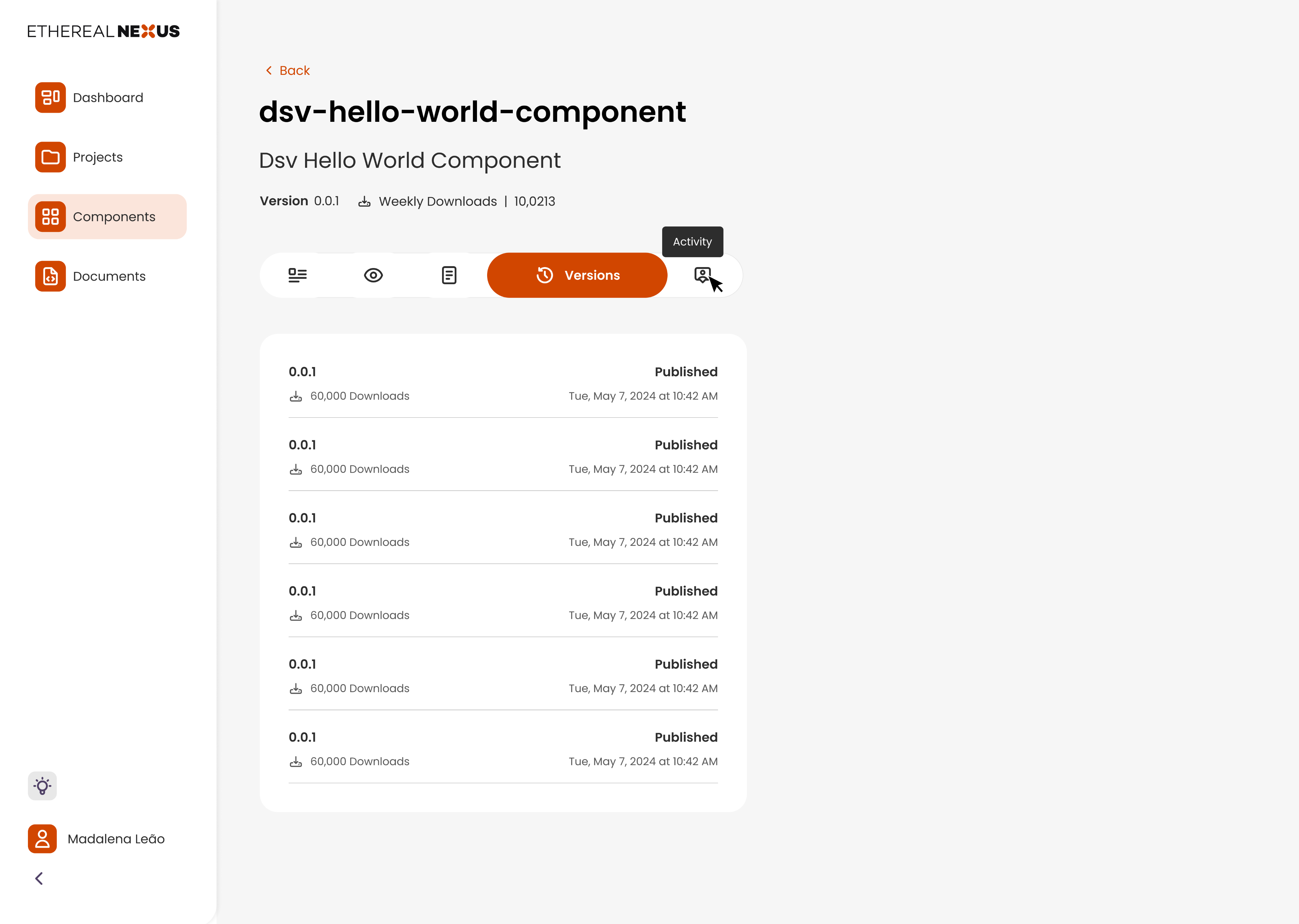
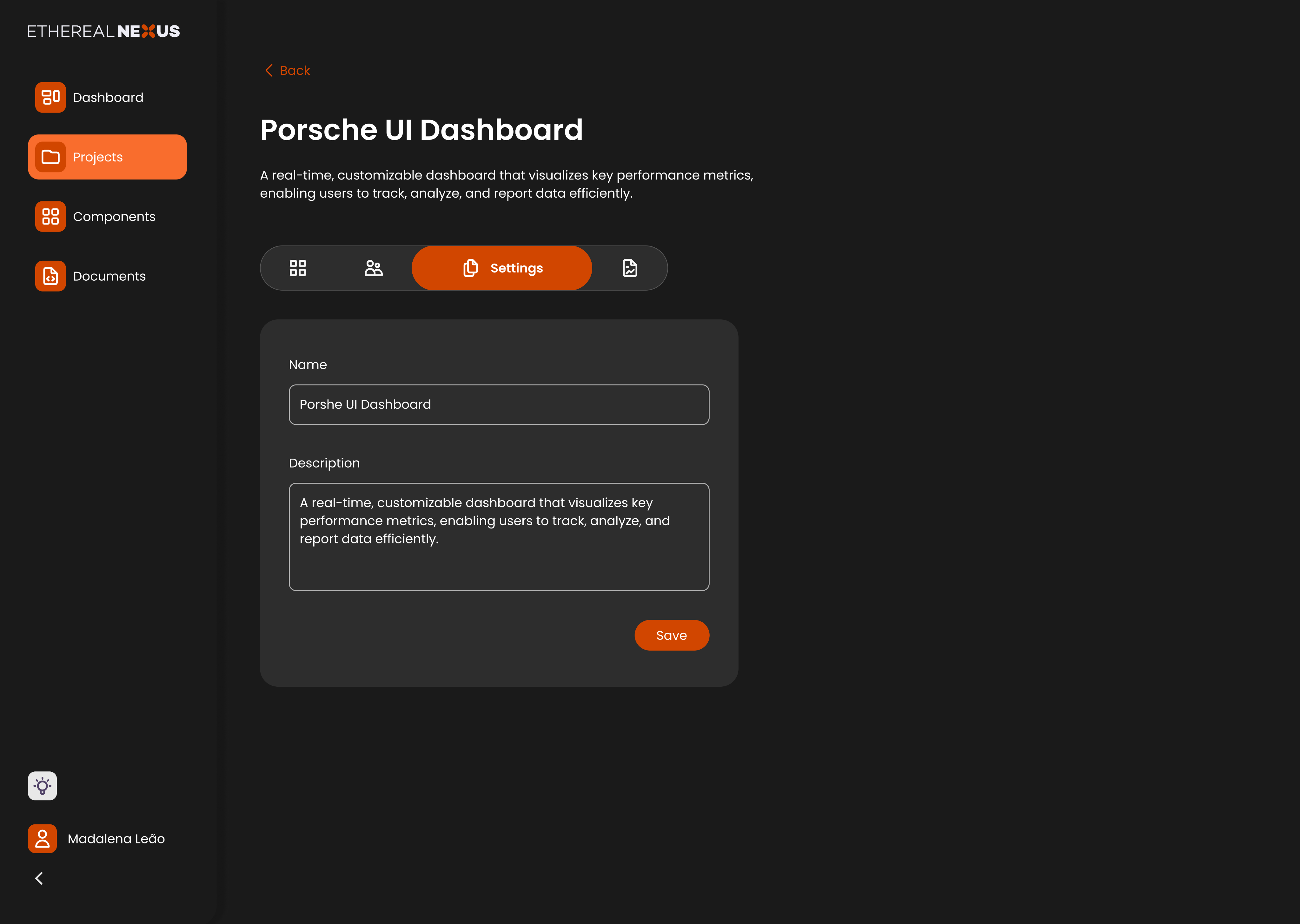
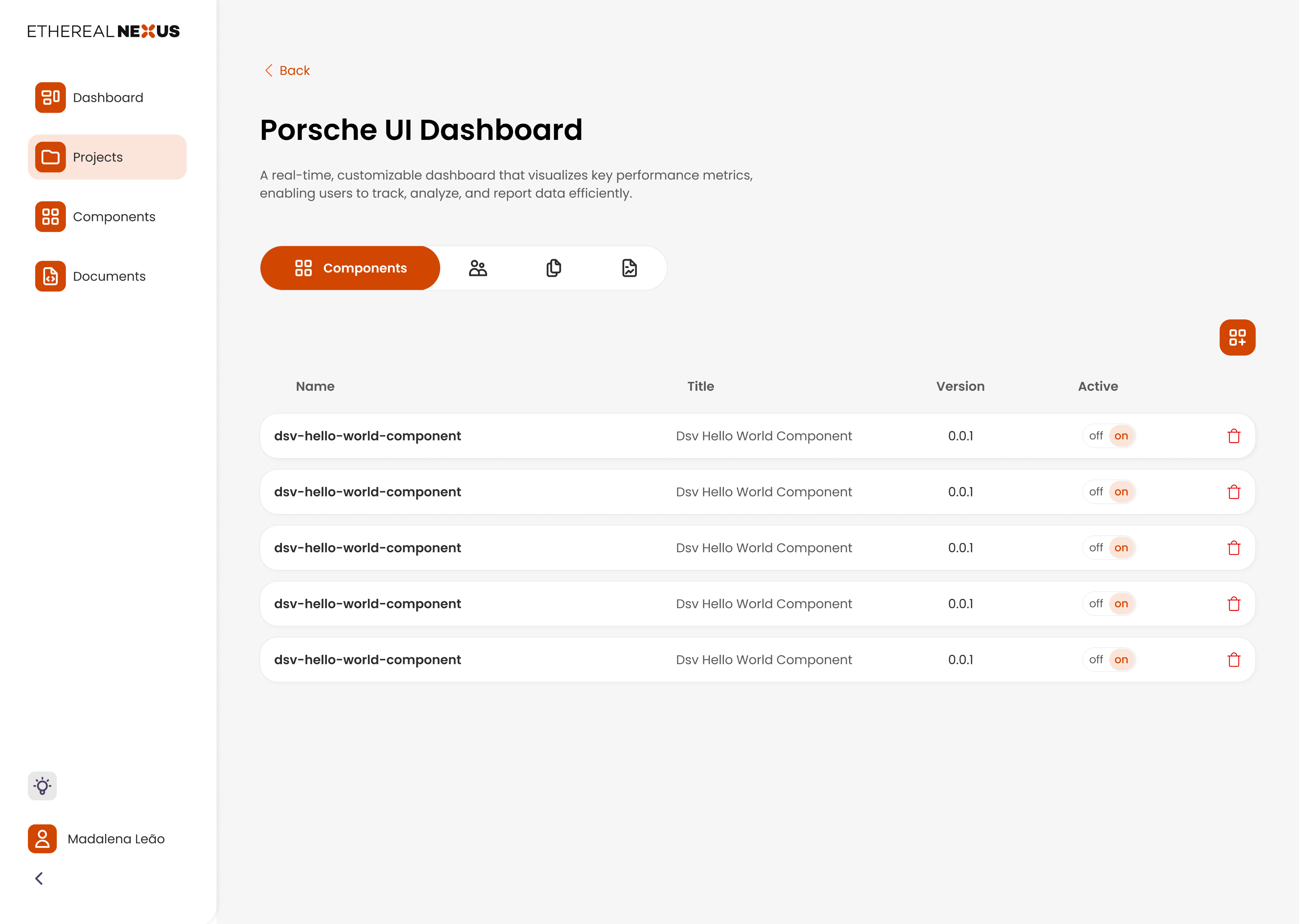
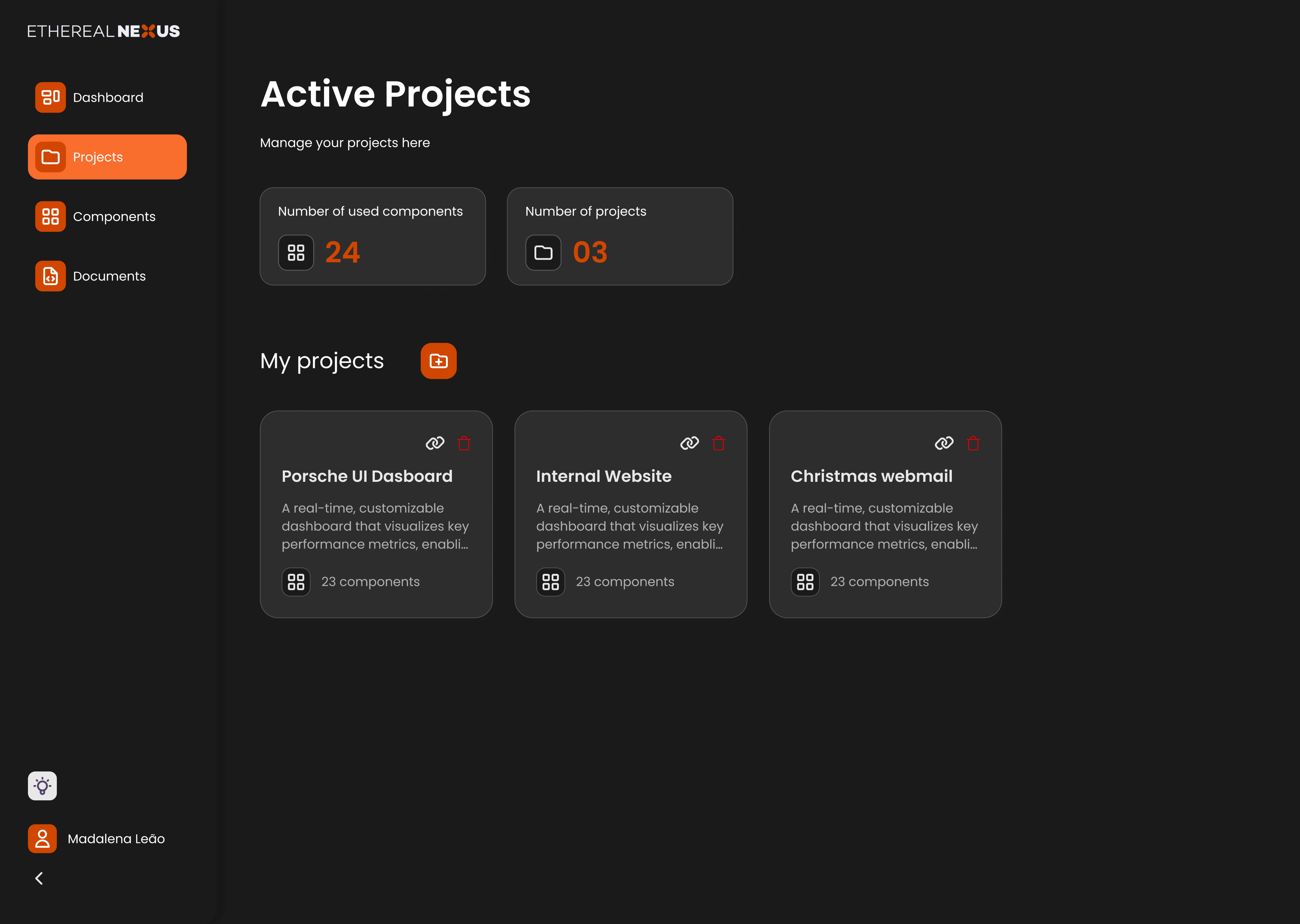
The project produced a redesigned dashboard direction and a reusable UI library, connecting research findings to information architecture, component views and editing flows.
Clearer discovery
Structured views and search controls support component discovery.
More visible states
Status information and confirmation patterns make system behaviour explicit.
A consistent foundation
Reusable components and documented states support design and development.