Wpp open
Enterprise AI · Product design · 2026Turning a homepage into a contextual work surface.
I helped rethink how users resume work, discover relevant AI capabilities and understand what needs their attention across WPP Open.
Product Designer
On going
Figma
AI
2 PD · 4 FE · 4 BE · 1 PM · 2 QA
01 · CONTEXT + PROBLEM
WPP Open is WPP’s platform for marketing teams and clients. It brings together tools, data and AI agents in one workspace, supporting work from strategy and campaign creation to content production and media planning. It helps teams collaborate and move more easily between tasks and projects.
The platform was bringing together Chat, Canvas, Agents, client workspaces and operational workflows. But the homepage was still behaving mainly as a collection of entry points. Users often arrived with work already in progress. The opportunity was to make the homepage help them continue that work, understand what mattered and discover useful capabilities in context.
The design challenge was not “what else can we put on the homepage?” It was “what deserves to be on the homepage at all?”
02 · research + strategic reframe
Research revealed where the homepage was falling short.
We drew on 8 qualitative interviews and 85 questionnaire responses to understand how people used WPP Open. The homepage gave them several ways into the platform, but offered limited help with work already in progress. People wanted to return to relevant work, understand their client or project context, and discover useful AI capabilities.
We also found that some people mistook the main Chat input for a search bar. They did not realise they could start a conversation there. Alongside the card concepts, this gave us a clear reason to revisit how people start work on the homepage and how they move through the platform.
Qualitative interviews
Questionnaire responses
“Users are not looking for what work to do next; they are looking for help moving work forward.”
CONTINUITY
Return to meaningful work quickly.
CONTEXT
See information relevant to the client or project.
DISCOVERY
Find useful AI capabilities and understand how to start using them.
ROLE VARIANCE
Show different signals to people with different needs.
Turning insights into a design direction
The research shaped three connected areas of exploration: contextual cards that help people resume and act on work; a clearer entry point that makes Chat and Canvas distinct; and navigation that helps people find their way across the platform. As part of that navigation work, we explored moving from the top bar to a side navigation with destinations grouped around how people work.
The guiding question became: What should the homepage help people do?
Continue meaningful work. See what needs attention. Find useful capabilities. Stay connected to context.
RESUME · ACT · DISCOVER · ORIENT
03 · Prioritising the homepage experience
From research signals to 3 areas of focus
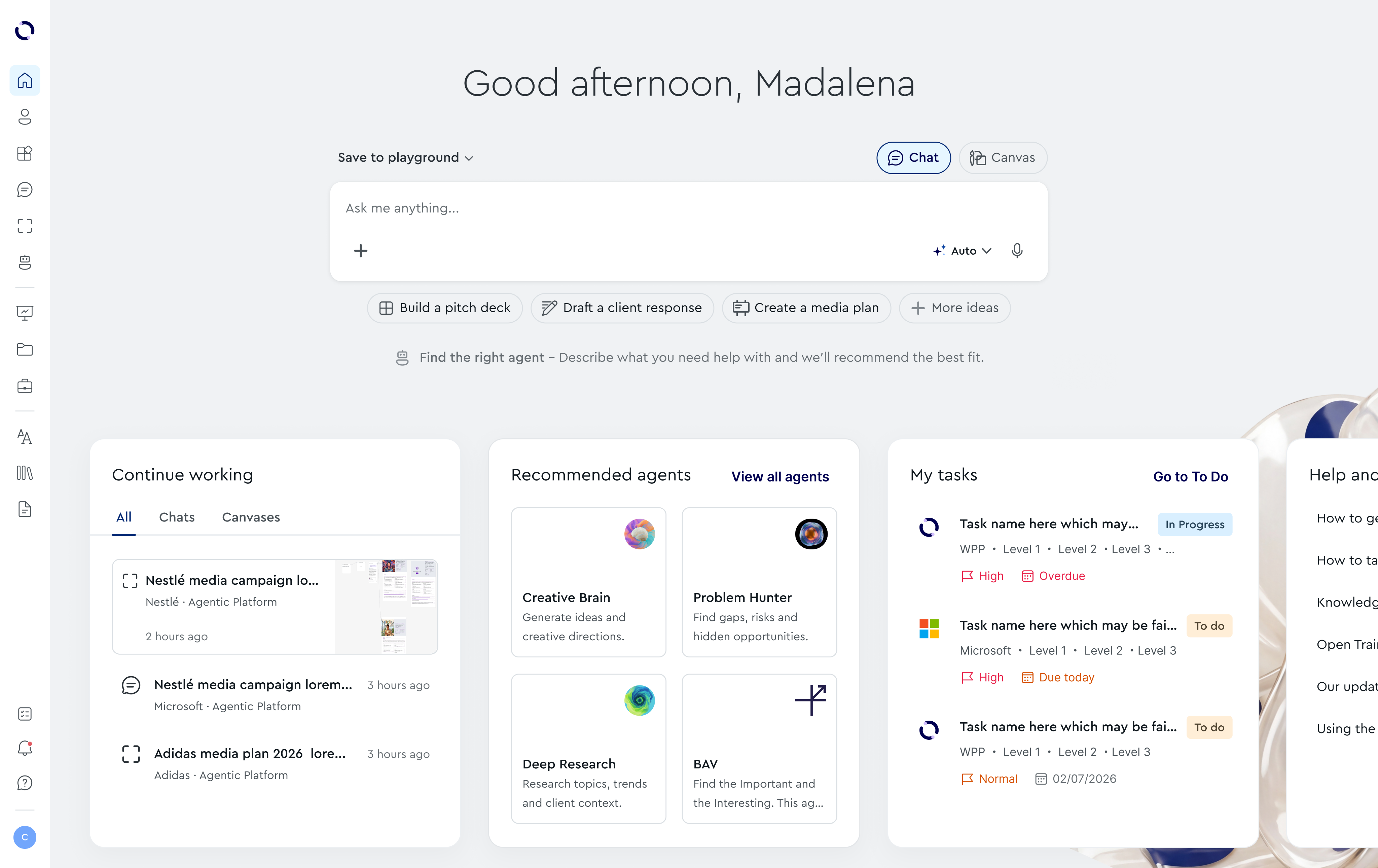
Research gave us several possible directions, so the first step was to decide what deserved attention on the homepage. I explored 12 contextual card concepts and compared the needs each one addressed. Some ideas overlapped and were combined: Urgent Tasks became part of To Do, Suggested Next Step became a contextual action, and Training and Onboarding became one learning concept. Continue Working, Recommended Agents and To Do emerged as the strongest card directions.
But prioritisation also meant looking beyond the cards. The unclear Chat input was affecting how people started work, while the top navigation had to support a growing range of destinations. We therefore developed three connected areas of the experience: the starting point, the content on the homepage and the way people navigate the platform.
Making the starting point clearer
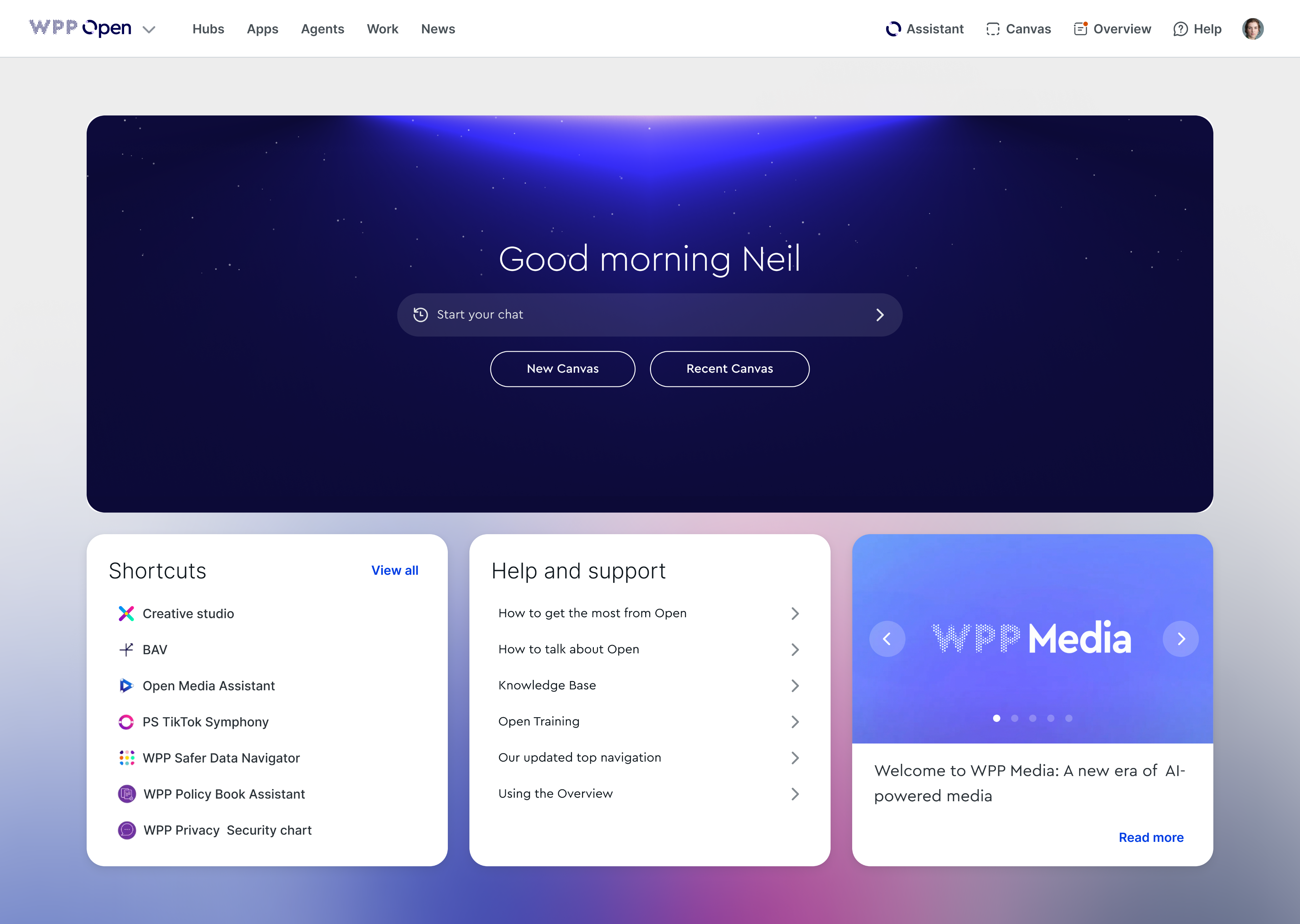
BEFORE: The homepage presented “Start your chat” as a single-line field. Some people read it as a search bar and did not realise they could start a conversation there. Chat and Canvas were also presented as separate actions without a clear explanation of how to begin.
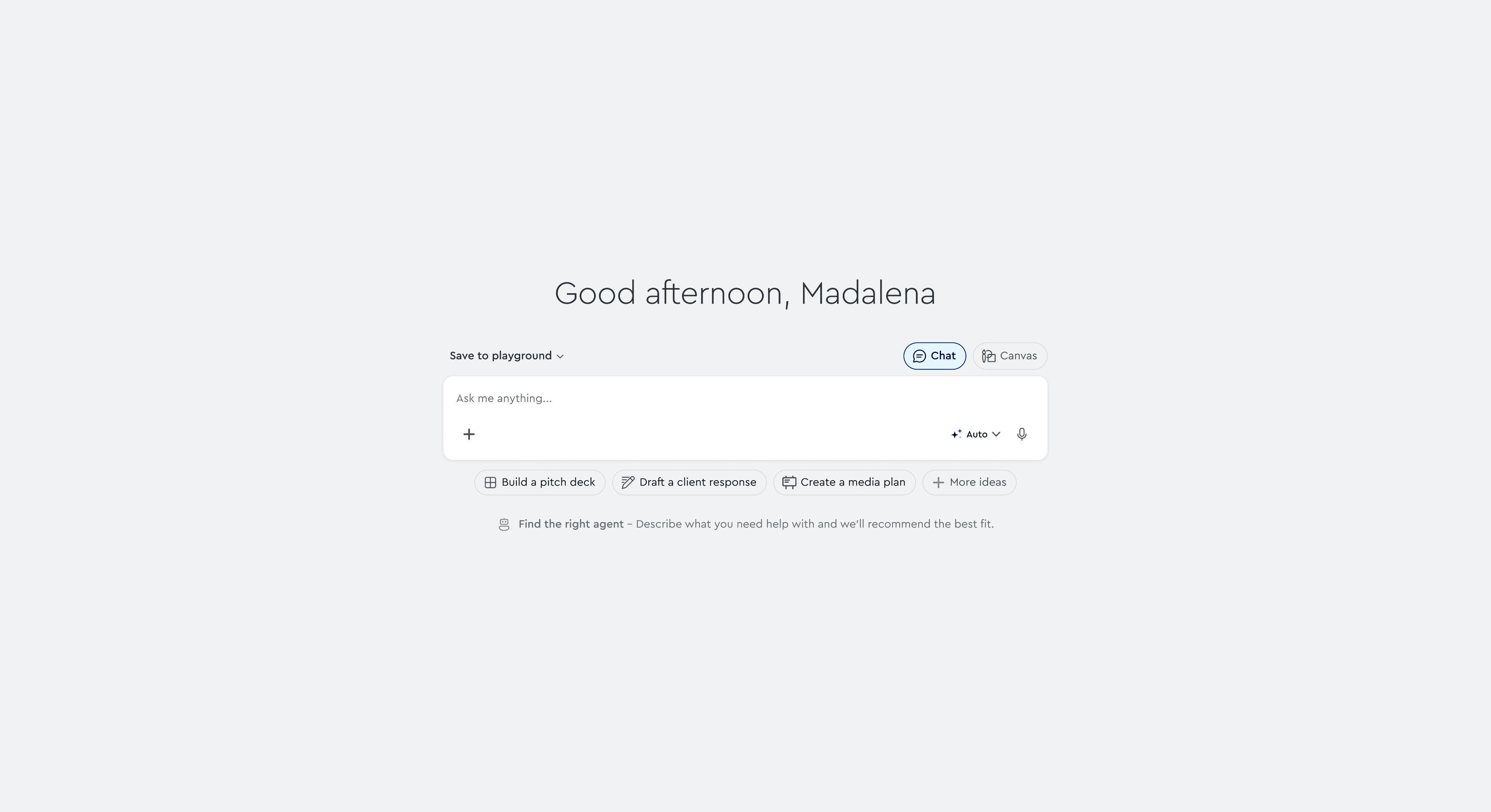
AFTER: We explored a more recognisable composer with an explicit choice between Chat and Canvas. Suggested prompts gave people concrete starting points, while visible controls made the input’s capabilities easier to understand. The goal was to help people recognise what they could do before typing.
An ambiguous starting point
A clearer way to begin
BEFORE: The homepage mixed shortcuts, support content and announcements. These gave people places to go, but offered limited help with work already in progress.
AFTER: We focused the card exploration on specific jobs: returning to work through Continue Working, seeing what needs attention through To Do, and discovering useful capabilities through Recommended Agents. Rather than giving every concept equal space, we consolidated overlapping ideas and prioritised the cards with the clearest user value.
Cards without a clear purpose

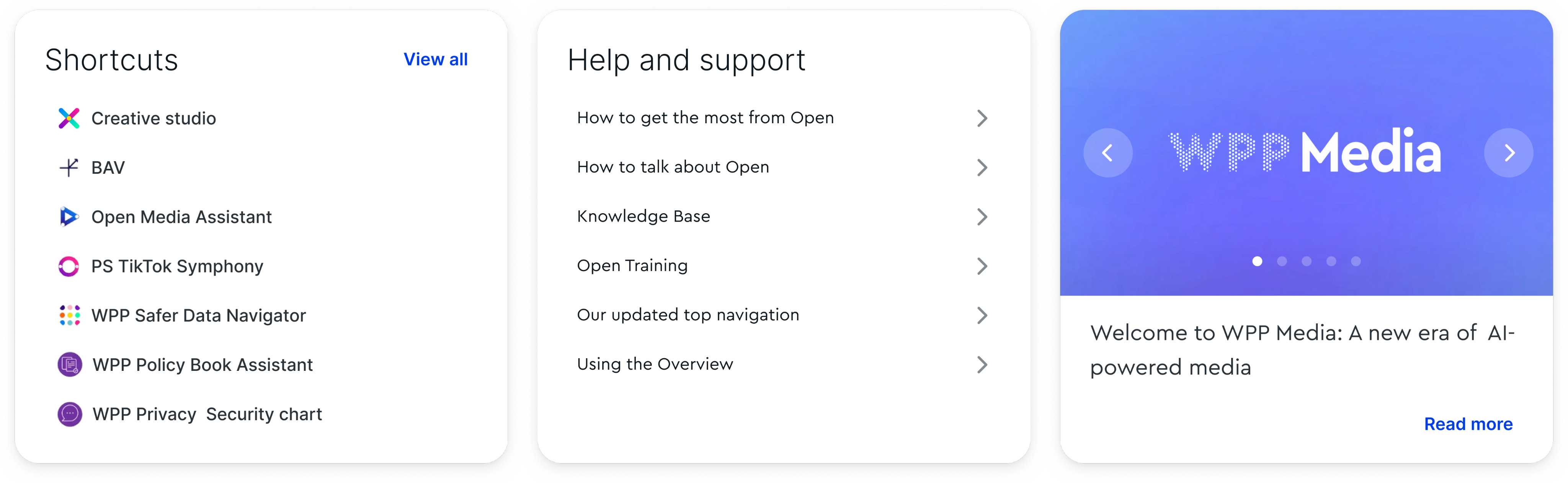
the homepage, but offered little help with work already
in progress.
Cards organised around user needs
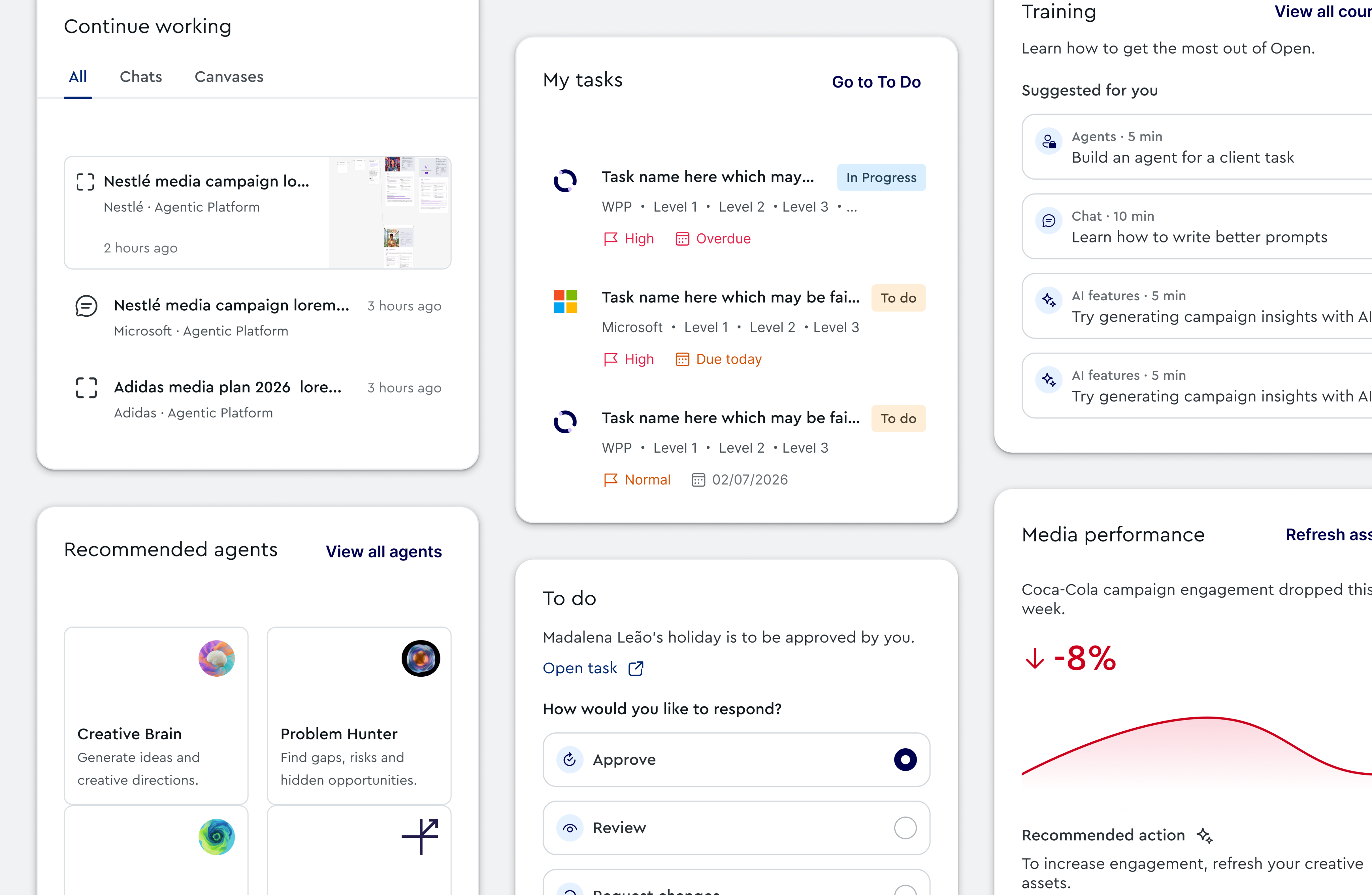
help people resume work, spot priorities and discover useful capabilities.
BEFORE: The top navigation spread destinations across both sides of the page, mixing platform areas such as Hubs, Apps and Agents with tools such as Assistant and Canvas. This offered access to individual features, but made the relationship between tools, work and content less explicit.
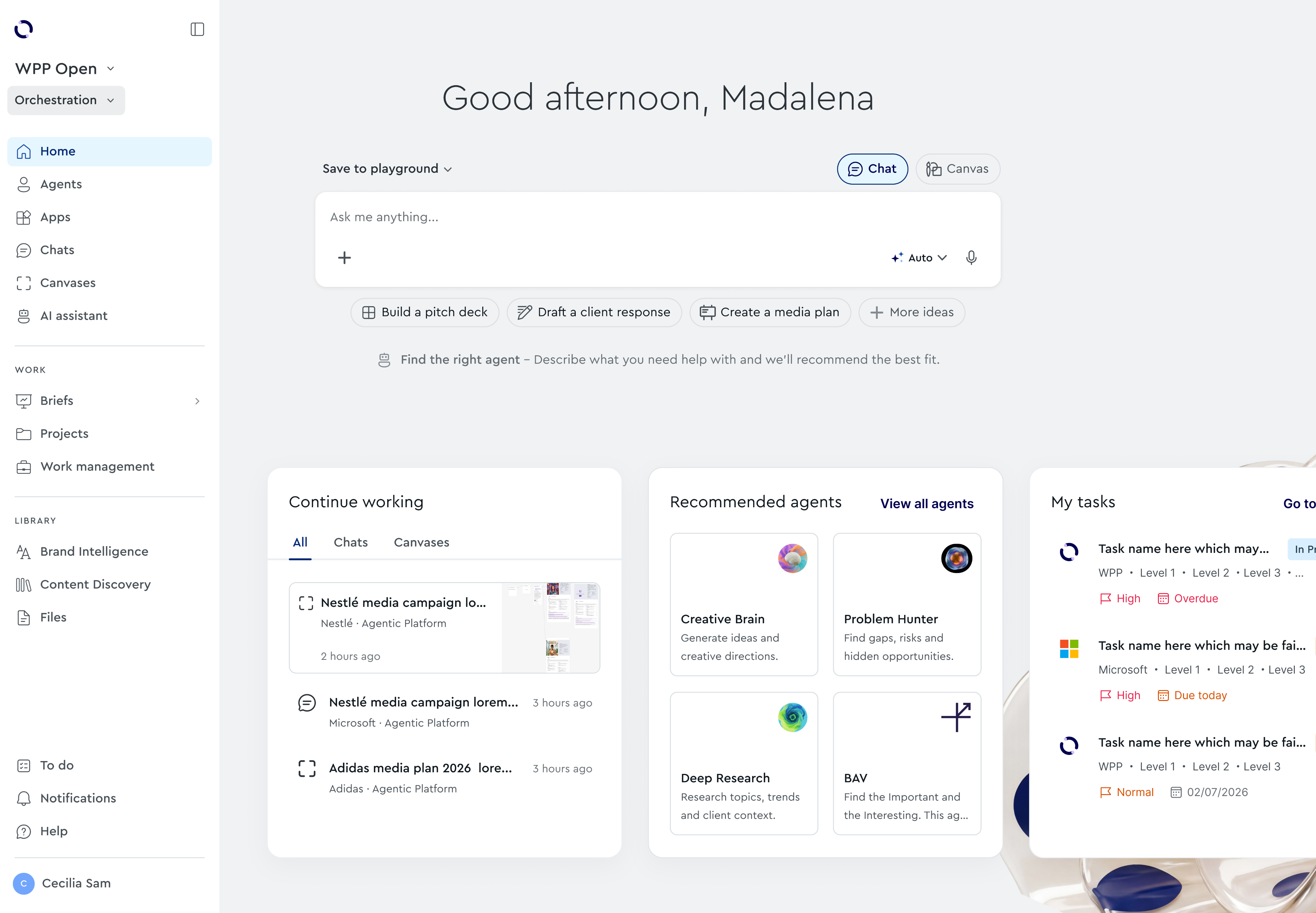
AFTER: We moved to a contextual sidebar with a clearer hierarchy. Agents, Apps, Chats and Canvases sit together, while Work groups Briefs, Projects and Work Management, and Library brings together Brand Intelligence, Content Discovery and Files. Workspace and context selectors sit at the top, with personal tasks, notifications and help below. The sidebar can collapse to give more space to the current task, while keeping navigation accessible.
Navigation spread across the page
A clearer, contextual hierarchy
04 · Outcome & next steps
A clearer direction for the homepage
The work established a connected design direction across the composer, contextual cards and navigation. It translated research findings into concrete flows and interface proposals, with a shared focus on helping people start, resume and navigate work.
Clearer entry points
A recognisable composer with explicit Chat and Canvas options, suggested prompts and a path to agent discovery.
More purposeful content
Card concepts prioritised around work continuity, tasks and relevant AI capabilities.
A contextual structure
A sidebar that groups tools, work and resources within the selected workspace.